Bloom
by Aneela
A premium made-to-order skincare platform where storytelling, commerce and production live as one considered experience.
A label built by hand.
Aneela started Bloom from her kitchen — a small line of skincare made slowly, for people she knew by name. The label grew because the products were honest. But growth introduced a quieter problem: a handmade brand needed a digital home that could carry its intent without diluting it.
We were invited in not to "build a store", but to translate a maker's philosophy into a platform: something that could hold the ritual of made-to-order production, tell the story of every ingredient, and still feel calm on a Tuesday-afternoon phone screen.
"I didn't want a shop. I wanted a place that felt like the way I actually make the products — slow, considered, and entirely mine."
A handmade label deserves a digital home just as considered.
Every product is prepared to order — a slower, more intentional way of working that most commerce platforms simply weren't built to respect.
Customers arrive mostly on mobile, curious rather than convinced. They want to understand the ingredients, feel confident about what "made fresh" really means, and finish a purchase without friction. The brand needed a home editorial enough to build trust, and practical enough to run a real production workflow behind it.
- Position a premium, handmade brand online
- Explain a made-to-order production model
- Build trust with first-time skincare buyers
- Design for a majority-mobile audience
- Educate customers on ingredients & rituals
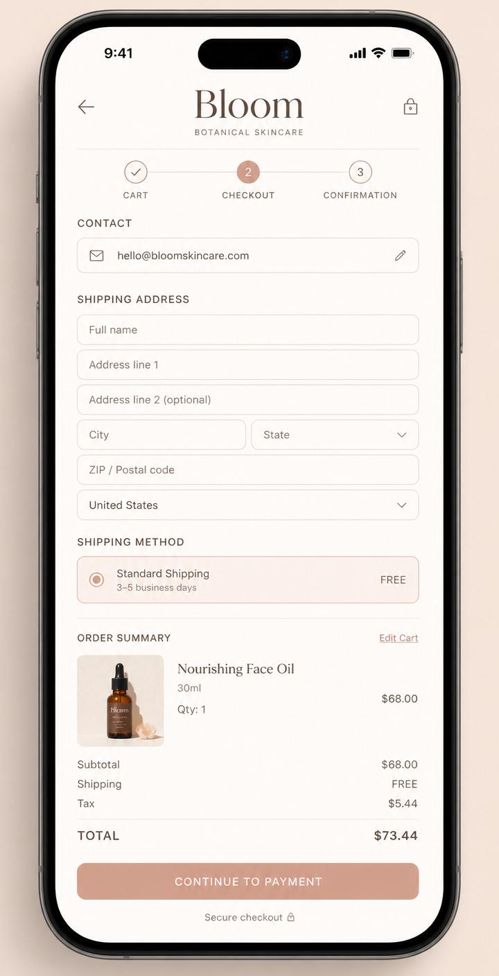
- Keep the checkout calm and low-friction
Five principles, applied without compromise.
Trust
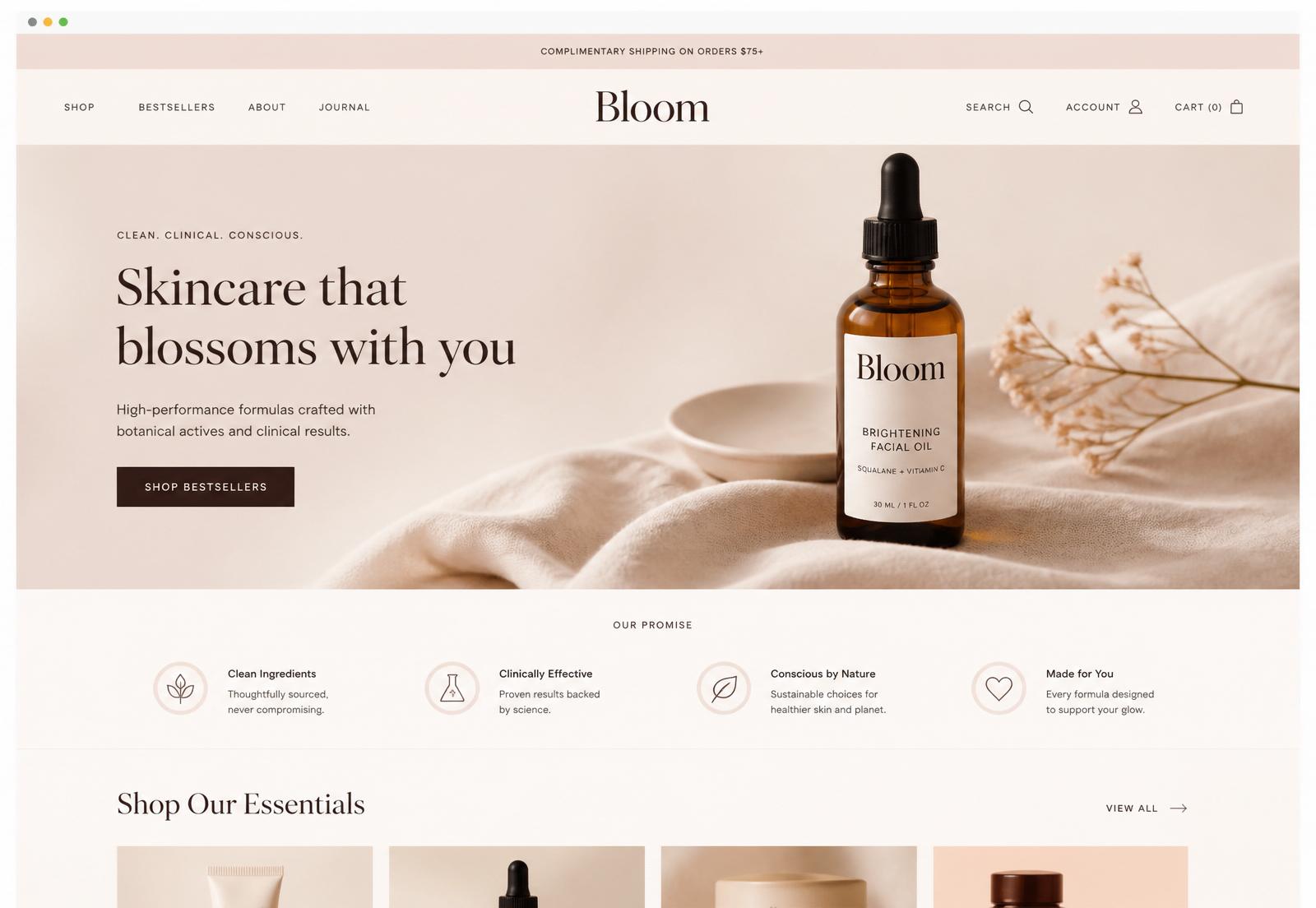
Trust is earned before the cart. The homepage reads like a printed cover — restrained, confident, quiet. Nothing shouts because nothing needs to.
Storytelling
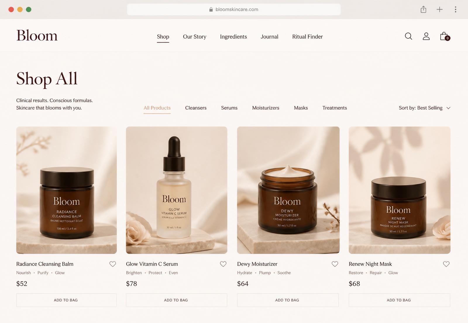
Every product page is written like a curator's note. The maker's voice appears where a spec sheet usually would, and photography is treated as still life, not stock.
Education
Ingredients aren't buried. Each is explained in plain language — what it does, where it comes from, why it's in the formula. Understanding replaces persuasion.
Mobile-first
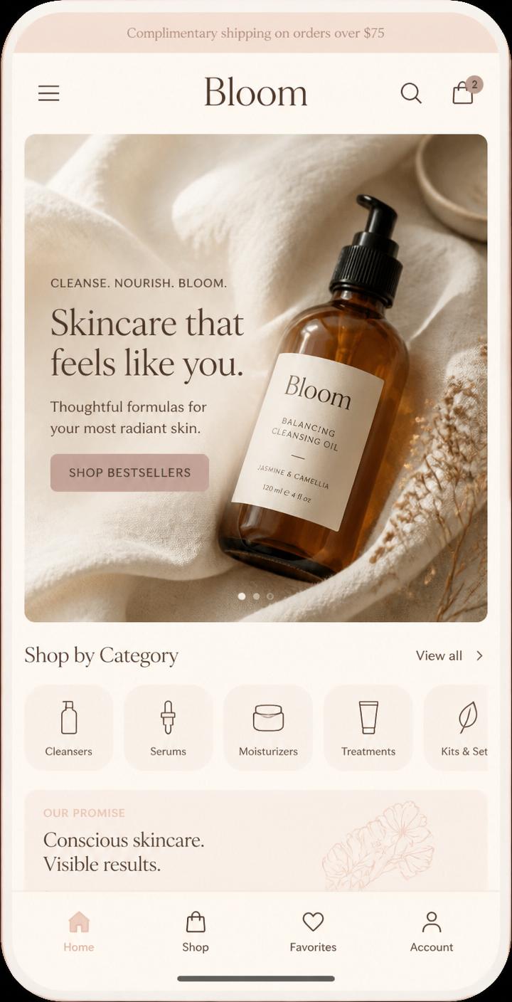
Every layout was proven on a phone before it earned a desktop treatment. One-thumb navigation, calm tap targets, magazine-style reading — the phone is the primary canvas.
Made Fresh to Order
The production reality shapes the interface: honest lead times, quiet order updates, and a checkout that treats waiting as anticipation rather than delay.
A quiet, editorial visual language.
Every element was chosen to feel like a considered object. Restraint over decoration, structure over noise.
A modern serif for editorial voice, paired with a quiet humanist sans for interface clarity.
Warm ivory, blush and softened graphite — a palette borrowed from linen, paper and amber glass.
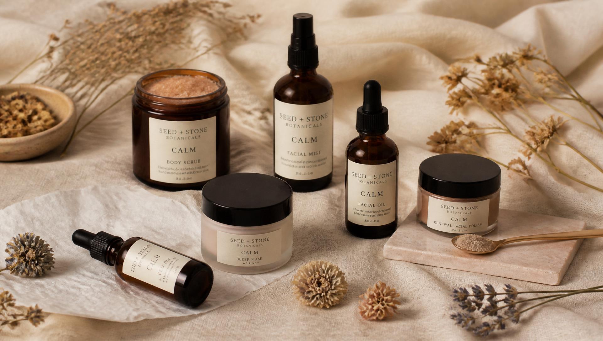
Natural light, single subject, generous negative space. Product treated as still life.
A single spacing scale used consistently across every surface — so the page breathes at every breakpoint.
Calm easing, short durations, nothing that competes with the product. Motion as punctuation.
Designed on a phone, before a desktop.
Most Bloom customers arrive on mobile — often between other things. Every layout, tap target and reading rhythm was proven on a phone before it ever earned a desktop treatment.
- One-thumb navigation with generous, calm tap targets.
- Product stories that read like a magazine, not a spec sheet.
- Guest checkout that removes friction without hiding trust cues.
- Optimised for mid-range devices, not just showroom phones.
A calm path from curiosity to made-fresh.
Five deliberate steps, each designed to lower doubt and build anticipation for something worth waiting for.
Discover
Editorial homepage introduces the brand's point of view.
Learn
Ingredient stories build understanding, not obligation.
Choose
Product pages read like a curator's note, not a spec sheet.
Checkout
Guest-first, minimal fields, honest trust signals.
Made Fresh
The order enters production — the customer is kept informed.
A platform that grows without being rebuilt.
Beneath the editorial surface is an operational spine. Content is structured, not typed; the shop, story and production pipeline share one source of truth; and every screen is built to accept features the brand doesn't yet know it needs.
Operational thinking
Orders, production stages and customer messaging modelled as one connected flow.
Future-ready architecture
Structured content ready for subscription rituals, personalisation and AI recommendations.
Scalable platform
New categories, campaigns and languages ship without touching the visual system.
Maker-friendly ops
A back-of-house that lets the founder spend more time formulating, less time in spreadsheets.
Outcomes that matter to the business.
No vanity metrics. What actually changed for the label after launch.
A premium customer experience
An editorial home that positions Bloom alongside brands two sizes larger, without losing its handmade voice.
Trust-building UX
Guest checkout, honest ingredient stories and quiet reassurance where hesitation usually lives.
A production-aware workflow
A made-to-order pipeline that respects how the label actually operates, order by order.
A future-ready platform
Foundations ready for personalisation, subscription rituals and AI-assisted recommendations when the brand is ready.
What the project taught us.
Restraint is a feature
The most premium decision was almost always the one we didn't make. Whitespace out-performed decoration at every review.
The phone sets the standard
If a section didn't feel right on a mid-range Android, it wasn't right anywhere. Mobile-first stopped being a checkbox and became the ceiling.
Story compounds trust
Every paragraph the founder wrote in her own voice out-converted anything we could optimise into place afterwards.
Ops belong in design
The made-to-order workflow wasn't a back-office concern — it shaped the checkout, the lead times, and the tone of every email.
Chosen for longevity, not novelty.
Selected surfaces.
Click any image to view it in full.
"The website was never the product.
It was the first impression of the product."